


How to Build a Website Colour Palette in Under 30 Minutes
In this post, we’ll show you how to build a professional website colour scheme in under 30 minutes – with step-by-step instructions, helpful tools, and real examples from our Field Digital templates.
written by
Field Digital
May 15, 2025
Blog Topic //
If you’ve ever opened a blank website template and thought, “Where do I even start with my colour palette?”– you’re not alone. Your colour scheme can make or break your brand’s first impression. The good news? You don’t need to be a designer (or spend hours scrolling Pinterest) to create a stunning, cohesive colour palette.
In this post, we’ll show you how to build a professional website colour scheme in under 30 minutes – with step-by-step instructions, helpful tools, and real examples from our Field Digital templates.
⏱️ Why a Cohesive Colour Scheme Matters (Especially When You’re Short on Time)
Before we jump in, here’s why this matters:
✅ A good colour scheme creates visual harmony
✅ It instantly communicates your brand’s personality
✅ It boosts user trust and keeps people on your site longer
✅ And yes – it makes your website look more expensive
Let’s get started.
🔧 Step 1: Start With a Brand Vibe (5 Minutes)
Before you open a colour picker, ask: What do I want people to feel when they visit my site?
Here’s a colour palette cheat sheet:
| Brand Vibe | Colour Family Examples |
|---|---|
| Calm + Trustworthy | Soft greens, neutrals, warm taupes |
| Bold + Energetic | Orange, coral, deep blue |
| Feminine + Creative | Blush, lilac, ivory, gold |
| Luxurious + Premium | Navy, black, champagne, burgundy |
| Natural + Grounded | Olive, clay, terracotta, cream |
Write down 3–5 adjectives that describe your brand. This will guide your palette choices.
🎯 Step 2: Choose Your Base Colour (5 Minutes)
This is your primary brand colour – the one that shows up most often (buttons, links, headlines).
➡ Ask yourself: “If I could pick just one colour to represent my brand, what would it be?”
Pro tip: Choose a colour palatte that aligns with your brand vibe and contrasts well with white or black for readability.
Example:
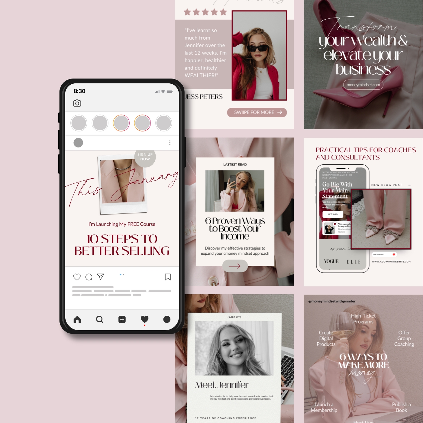
- Jennifer uses a juicy pink (
#F57224) as the base for a fun, warm vibe. - Frankie Thrive uses deep navy (
#1D1E2C) for a polished, professional feel.
🧩 Step 3: Add a Neutral Background (5 Minutes)
Neutrals keep your site from feeling too busy and give breathing room to your content.
Pick a clean, soft neutral for your main background:
- Cream (
#FAF8F6) - Soft grey (
#F5F5F5) - Off-white (
#FDFBF9) - Pale beige (
#F2EDE4)
Avoid stark white unless your vibe is super modern or editorial.
🎨 Step 4: Add 2–3 Accent Colours (10 Minutes)
This is where the magic happens. Accent colours highlight key info (CTAs, testimonials, footers, etc.) and add personality to your design.
Types of accents to choose:
- A warm pop (peach, coral, rose)
- A soft contrast (sage, dusty blue)
- A dark anchor (espresso, charcoal)
Real example from Beau Octavia:
- Peach accent:
#F8D4B2 - Soft green:
#AAB7A0 - Deep charcoal:
#2C2C2C
Use a tool like Coolors or Adobe Color to test out combinations quickly.
🧠 Step 5: Test for Contrast + Accessibility (3 Minutes)
A beautiful palette is useless if no one can read your site.
➡ Use WebAIM Contrast Checker to make sure your text passes accessibility standards.
Check:
- Text on background
- Buttons on backgrounds
- Links and callouts
Aim for AAA compliance where possible for maximum readability and accessibility.
💡 Bonus Tip: Use a Ready-Made Template for Instant Cohesion
Feeling overwhelmed? Our Field Digital website templates are designed with pre-built colour schemes that are easy to customize—so you don’t have to start from scratch.
Here are a few of our favorite palette-driven designs:
- Beau Octavia – Soft blues + cream for therapists
- Jennifer – Pink + Orange for feminine consultants
- Clementine Sweetpea – Soft greens + peach for wellness brands
✨ Explore all templates here → https://field-digital.com/template-customisation/
📌 Save This for Later – Your Quick Checklist
✅ Defined your brand vibe
✅ Picked a base colour
✅ Added a neutral
✅ Chose 2–3 accents
✅ Tested for contrast
You’re done—and you did it in under 30 minutes 🎉
Need a second opinion or want help picking colours? Check out our template customization service where we match your brand personality with a colour scheme that converts.
Subscribe
DESIGN TIPS
Get our best tips and tricks on design & marketing in your inbox every week.
hot topics
SHOWIT
meet your bloggers

A storytelling-obsessed website copywriter and a design-savvy digital creative.
Now that’s a dream team!
coaching
MARKETING
BRANDING
COPYWRITING
Millie & Flo Field
DESIGN
Leave a Reply
The most popular POSTS
Everyone's reading

01
02
03
04
05
Comments