


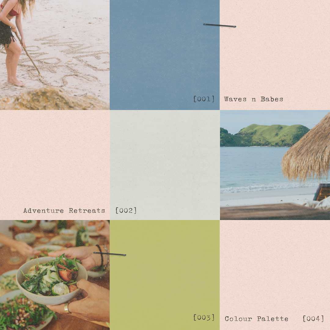
Mastering the Art of Colour in Web Design
First impressions are made in a matter of seconds. This might sound a little harsh, but whoever said you shouldn’t judge a book by its cover SHOULDN’T work in design.
One aspect of that all-important first impression that often gets overlooked but can significantly impact user engagement is the colour scheme of your website.
written by
Field Digital
Feb 13, 2024
Blog Topic //
In this blog post, we’ll look into colour palettes. We will explore the art of colour to elevate your website, making it visually appealing and enhancing user experience.
I remember my primary school English teacher for two distinct reasons; her questionable taste; hear me out she paired a sausage dog scarf with a matching sausage dog jumper… yikes. And to add crime to punishment I distinctly remember her blatant misuse of the colour theory whilst doing so.
What is the colour theory? Colour theory is both the science and art of using colour. It explains how humans perceive colour; and the visual effects of how colours mix, match or contrast with each other. Colour theory also involves the messages colours communicate; and the methods used to replicate colour.
UNDERSTANDING THE PSYCHOLOGY OF COLOUR PALETTES:
Before you start splashing colours across your website (or outfits), it’s essential to understand the psychological impact of different colours. Colours evoke emotions and perceptions. So, choose a palette that aligns with your brand identity and resonates with your target audience. For instance, warm tones like red and orange can convey energy and passion. While cool tones like blue and green exude calm and trust.

CREATING CONSISTENT COLOUR PALETTES:
Consistency is key when it comes to colour usage on your website. Establish a cohesive colour palette that reflects your brand personality and remains consistent across all web pages. This not only contributes to a visually pleasing design but also helps in brand recognition.
HIGHLIGHTING CALLS-TO-ACTION (CTAS):
Strategically use vibrant colours to draw attention to important elements such as buttons, forms, and CTAs. A well-designed colour hierarchy can guide users through the website, emphasising key actions and encouraging engagement.
RESPONSIVE DESIGN FOR VARIOUS DEVICES:
Consider how your colour choices will appear on different devices and screen sizes. Responsive design ensures that your website looks visually appealing and functions well across a variety of devices. Test your colour palette on different screens to guarantee a consistent and enjoyable user experience.
A/B TESTING FOR OPTIMISATION:
Experiment with different colour combinations through A/B testing to understand which hues resonate best with your audience. Analysing user behaviour and engagement metrics can help you fine-tune your colour choices for maximum impact.
CONCLUSION
In the world of web design, colours are a powerful tool that will elevate your website. A colour palette will leave a lasting impression on visitors (either good or bad). By understanding the psychology of colours, creating a consistent palette, you can take your website’s visual appeal to new heights. Highlighting CTAs, ensuring responsiveness, and conducting A/B testing will further support visual website success.
Remember, a thoughtfully crafted colour scheme is not just visually pleasing. It is also a strategic element in creating a memorable and user-friendly online presence.

Subscribe
DESIGN TIPS
Get our best tips and tricks on design & marketing in your inbox every week.
hot topics
SHOWIT
meet your bloggers

A storytelling-obsessed website copywriter and a design-savvy digital creative.
Now that’s a dream team!
coaching
MARKETING
BRANDING
COPYWRITING
Millie & Flo Field
DESIGN
Leave a Reply
The most popular POSTS
Everyone's reading

01
02
03
04
05
Great article! I really appreciate the clear and detailed insights you’ve provided on this topic. It’s always refreshing to read content that breaks things down so well, making it easy for readers to grasp even complex ideas. I also found the practical tips you’ve shared to be very helpful. Looking forward to more informative posts like this! Keep up the good work!
Hello! Do you know if they make any plugins to assist with Search Engine Optimization? I’m trying to get my site to rank for some targeted keywords but I’m not seeing very good results.
If you know of any please share. Many thanks! I saw similar art here: Eco wool
Hi there, there are plenty of SEO wordpress plugins. Yoast is a popular option!