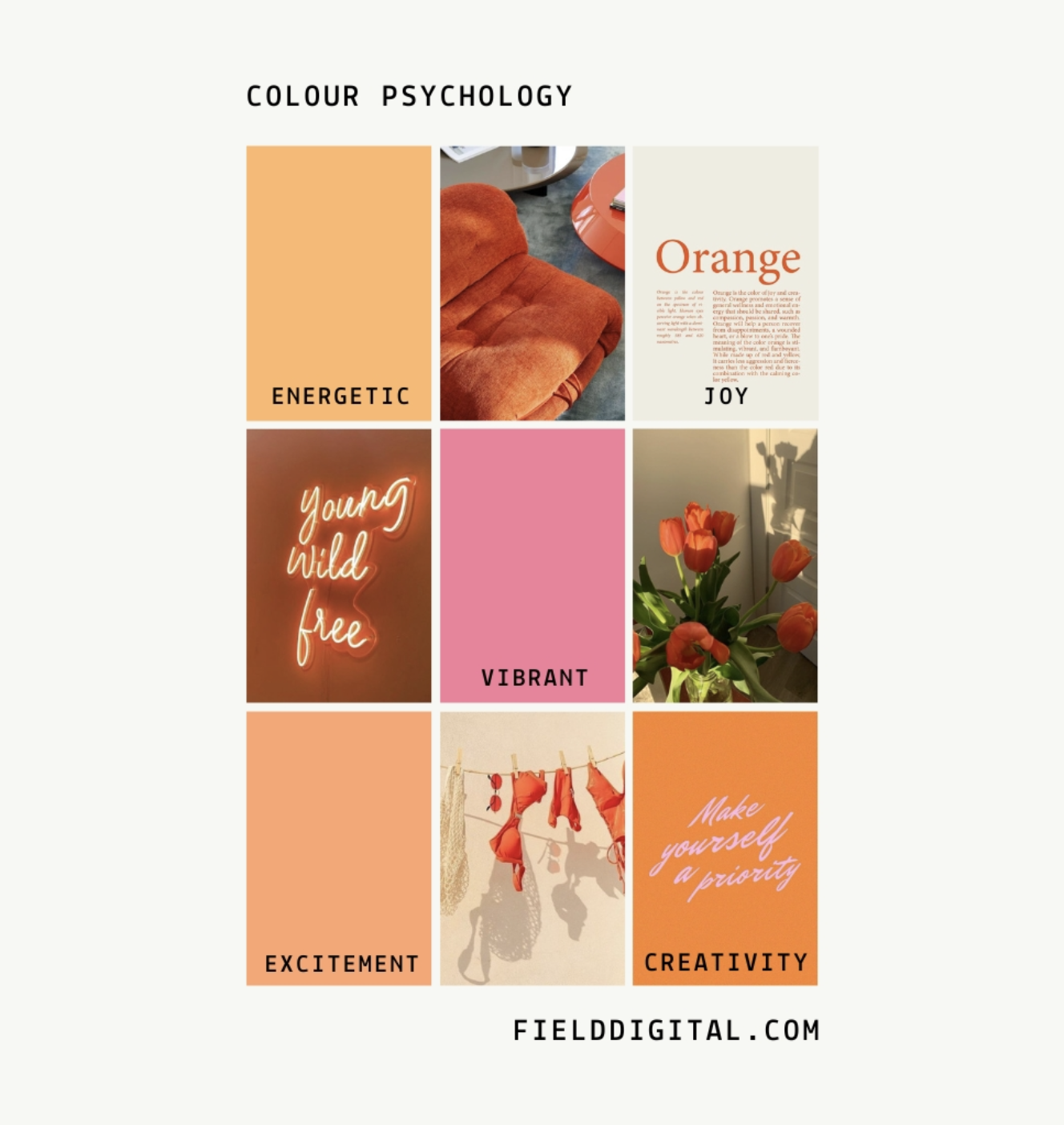
Colour psychology is a fascinating field that explores how different colours can evoke specific emotional responses in individuals. These responses are often deeply ingrained in our cultural, biological, and also personal experiences.
Colour holds immense power because every pixel and element is strategically placed in web design. Beyond just aesthetics, colours play a crucial role in evoking emotions, shaping perceptions, and also influencing user behaviour.

Let’s explore the emotional impact of colours and their strategic utilisation in web design:
- Red: Bold and attention-grabbing, red is associated with passion, excitement, and urgency. It can stimulate appetite (think fast-food logos) and create a sense of urgency. Making it ideal for call-to-action buttons or notifications.
- Blue: Calming and trustworthy, blue instills feelings of security, professionalism, and reliability. It’s commonly used by tech companies and financial institutions to convey stability and competence.
- Green: Symbolising nature, growth, and harmony, green is often associated with health, wealth, and sustainability. It’s a versatile colour suitable for a wide range of industries, particularly those focused on eco-friendly products or services.

- Yellow: Cheerful and optimistic, yellow radiates warmth and positivity. It can grab attention and convey a sense of happiness, also making it suitable for highlighting important information or creating a friendly vibe.
- Orange: Energetic and vibrant, orange combines the enthusiasm of red with the friendliness of yellow. It’s often used to evoke a sense of excitement and creativity, and also making it a popular choice for brands targeting a youthful audience.
- Purple: Regal and mysterious, purple is associated with luxury, spirituality, and creativity. It can evoke a sense of sophistication and elegance. Making it ideal for brands that want to stand out and make a memorable overall impression.
- Black: Sleek and sophisticated, black is synonymous with power, authority, and also elegance. It’s often used to create a sense of luxury and exclusivity, especially in fashion and luxury brands.
- White: Clean and minimalist, white signifies purity, simplicity, and clarity. It’s commonly used as a background colour to create a sense of space and focus attention on the content.
Conclusion
The strategic use of colour in web design goes beyond mere aesthetics; it’s a powerful tool for influencing emotions, shaping perceptions, and enhancing user experience. By understanding the psychology of colour and applying it thoughtfully, you can create visually compelling and emotional digital online spaces that overall leave a lasting impression on users.
Subscribe
DESIGN TIPS
Get our best tips and tricks on design & marketing in your inbox every week.
hot topics
SHOWIT
meet your bloggers
A storytelling-obsessed website copywriter and a design-savvy digital creative.
Now that’s a dream team!
coaching
MARKETING
BRANDING
COPYWRITING
Millie & Flo Field
DESIGN
Leave a Reply
The most popular POSTS
Everyone's reading
01
02
03
04
05

I’m extremely inspired along with your writing talents as well as with the
format for your blog. Is this a paid theme or did you modify it your self?
Either way stay up the excellent high quality writing,
it’s rare to look a great weblog like this one nowadays.
Instagram Auto follow!